
EQUI–organic drink
Services
Promotional Design Branding
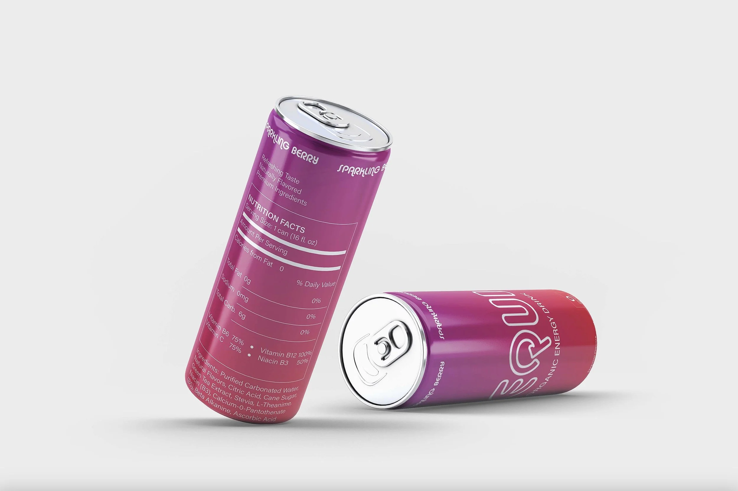
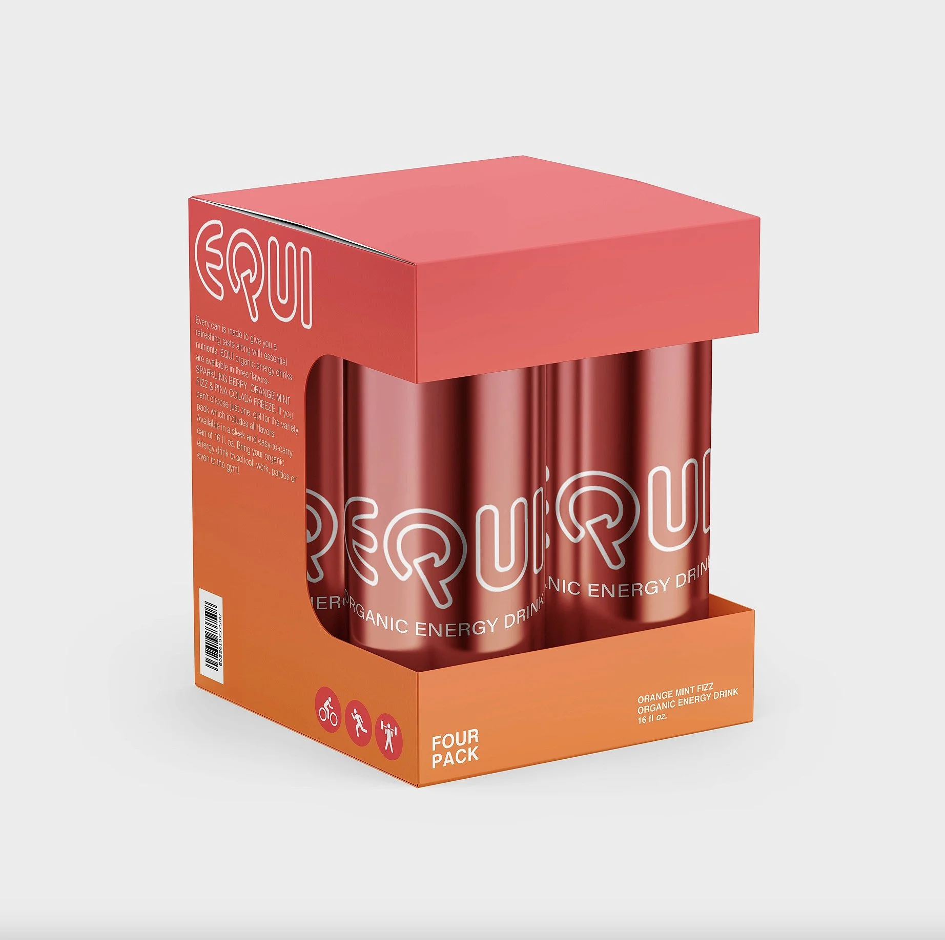
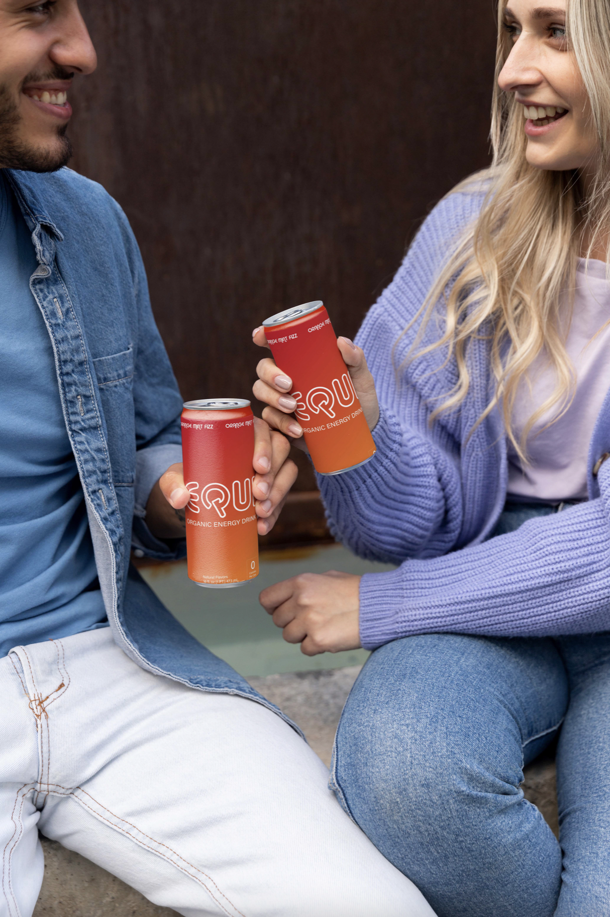
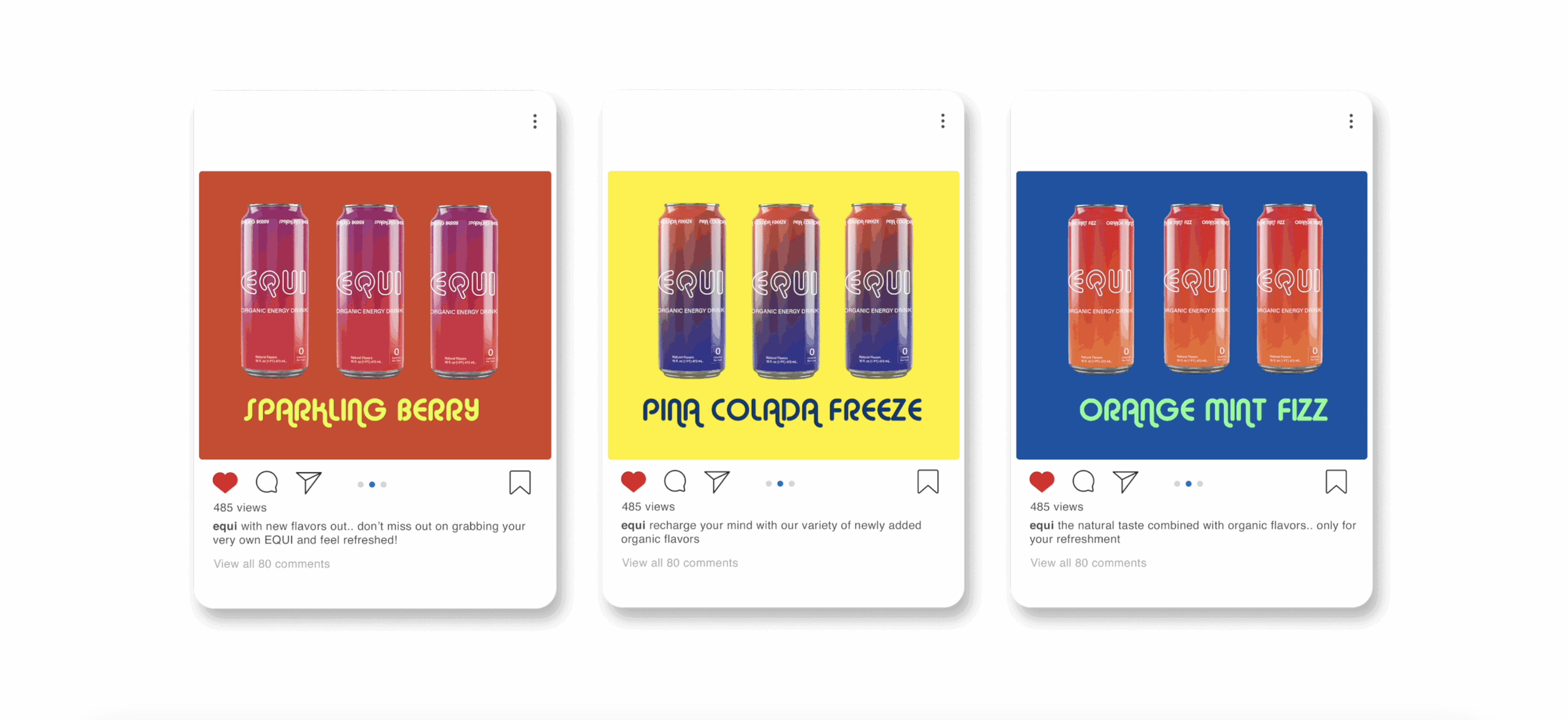
Creating a new visual identity for an energy drink brand. EQUI is committed to providing consumers with a healthier alternative to traditional energy drinks.
Project Narrative
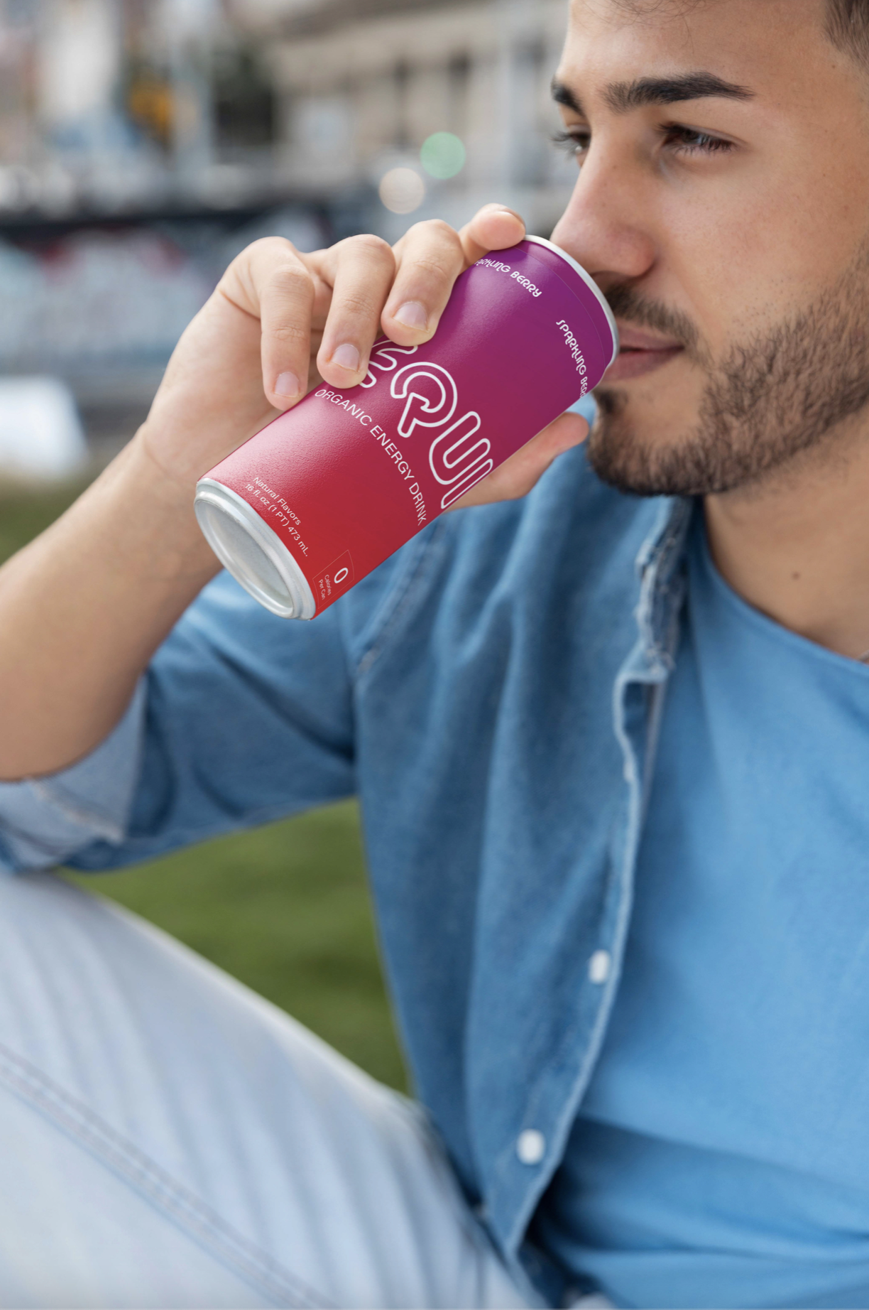
With a focus on wellness and sustainability, the brands new visual identity appeals to health-conscious individuals who lead an active lifestyle.
Project Objective
The design was selected to be featured in The Best Beverage Packaging Designs by DesignRush, a platform known for promoting the best designs.
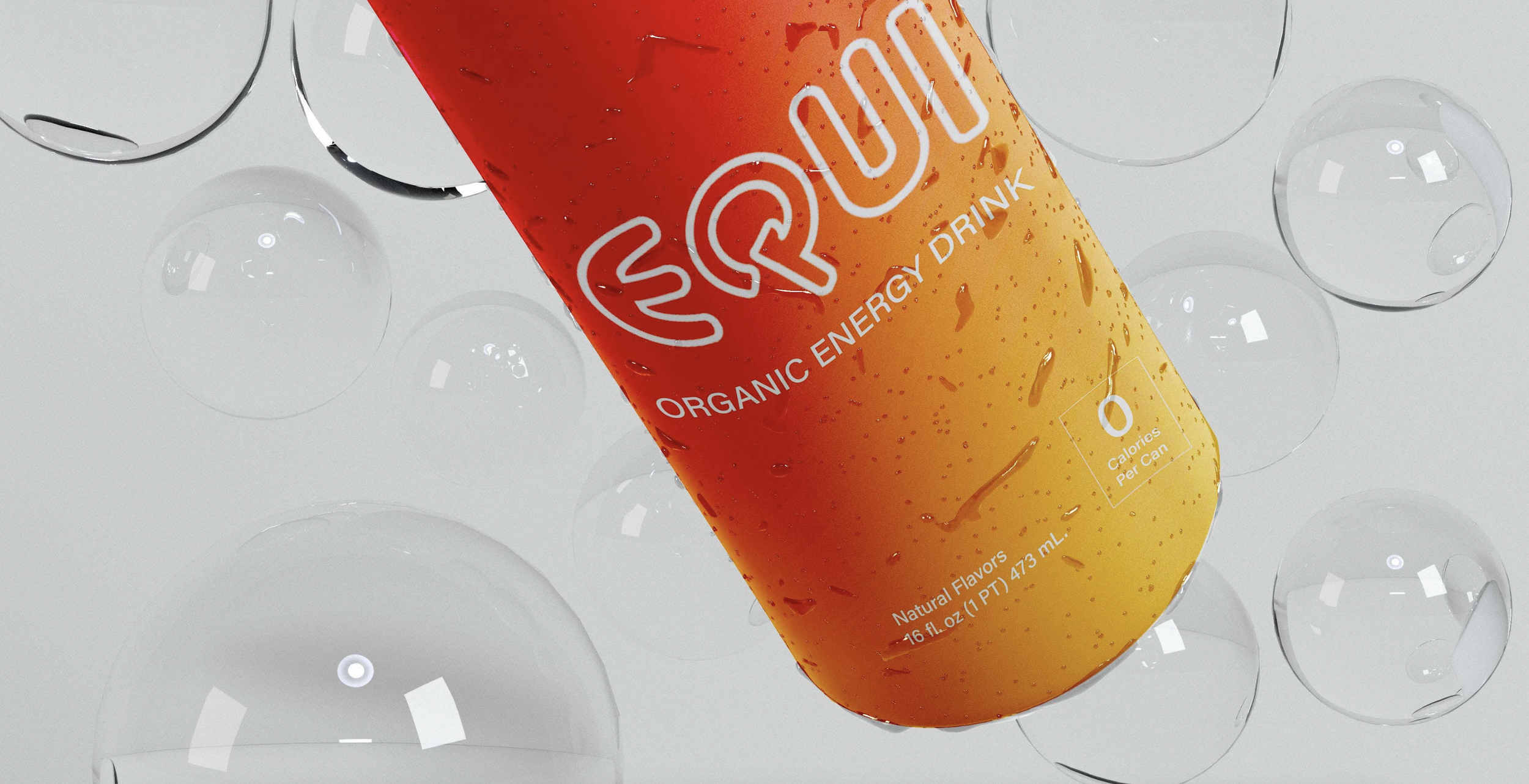
Alba has a modern feel with a retro appeal due to its slender letterforms with distinct geometric shapes.
Because of its balanced proportions and precise lines, Alba was implemented as the brand's typeface.
BRAND TYPEFACE
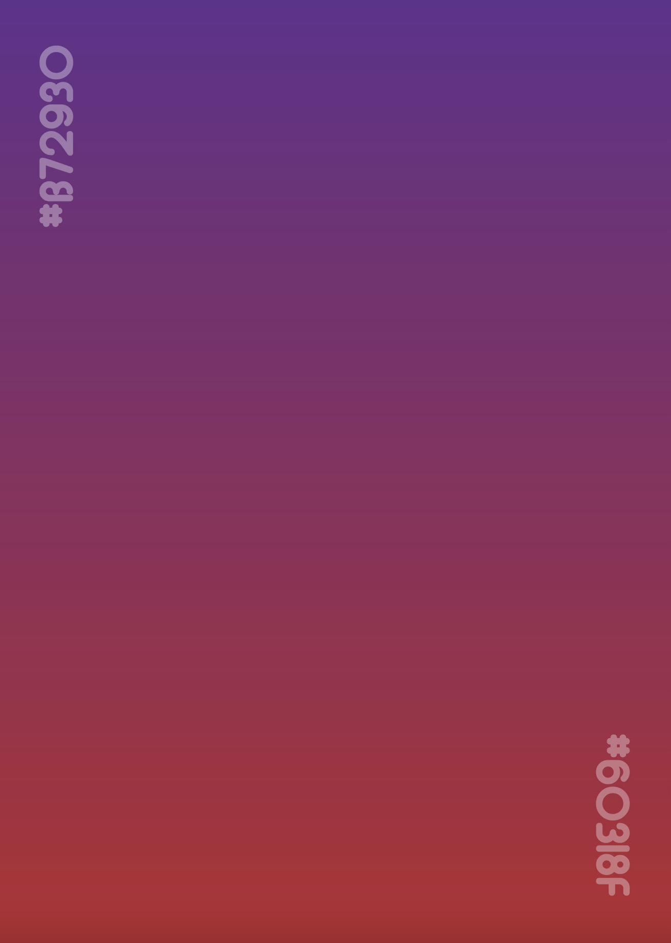
The color system for the brand combines two hues:
Tall Poppy (#B72930) and Bossanova (#60316F), which aids in creating an elegant gradient approach for the visual identity.


